Klinikum Dortmund GmbH
Corporate design
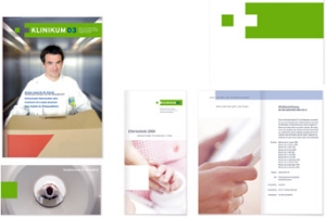
Klinikum Dortmund gGmbH is Germany’s second largest municipal hospital. After being spun off from the municipal network to become an independently operated unit, it now faces the challenge of increased competition. The task for the Wuppertal-based agency wppt:kommunikation was to design a unique profile that would present a strong brand image to the outside world as well as to company staff – an undertaking that required close collaboration with the management board. Displaying the colors green, blue and white, the logo contains the word brand “Klinikum DO,” standing for confidence, expertise and health. A green square is “cut out” of the left-hand side of the green bar and floats next to it, suspended in space, stimulating the viewer to reinsert it and representing the idea of healing. Simultaneously the outline of a cross is suggested, underlining the institution’s charitable mission. This new corporate design is being consistently employed by all Klinikum Dortmund communication media, including the company magazine and the annual report.