Primera line renewal
Cosmetic packaging
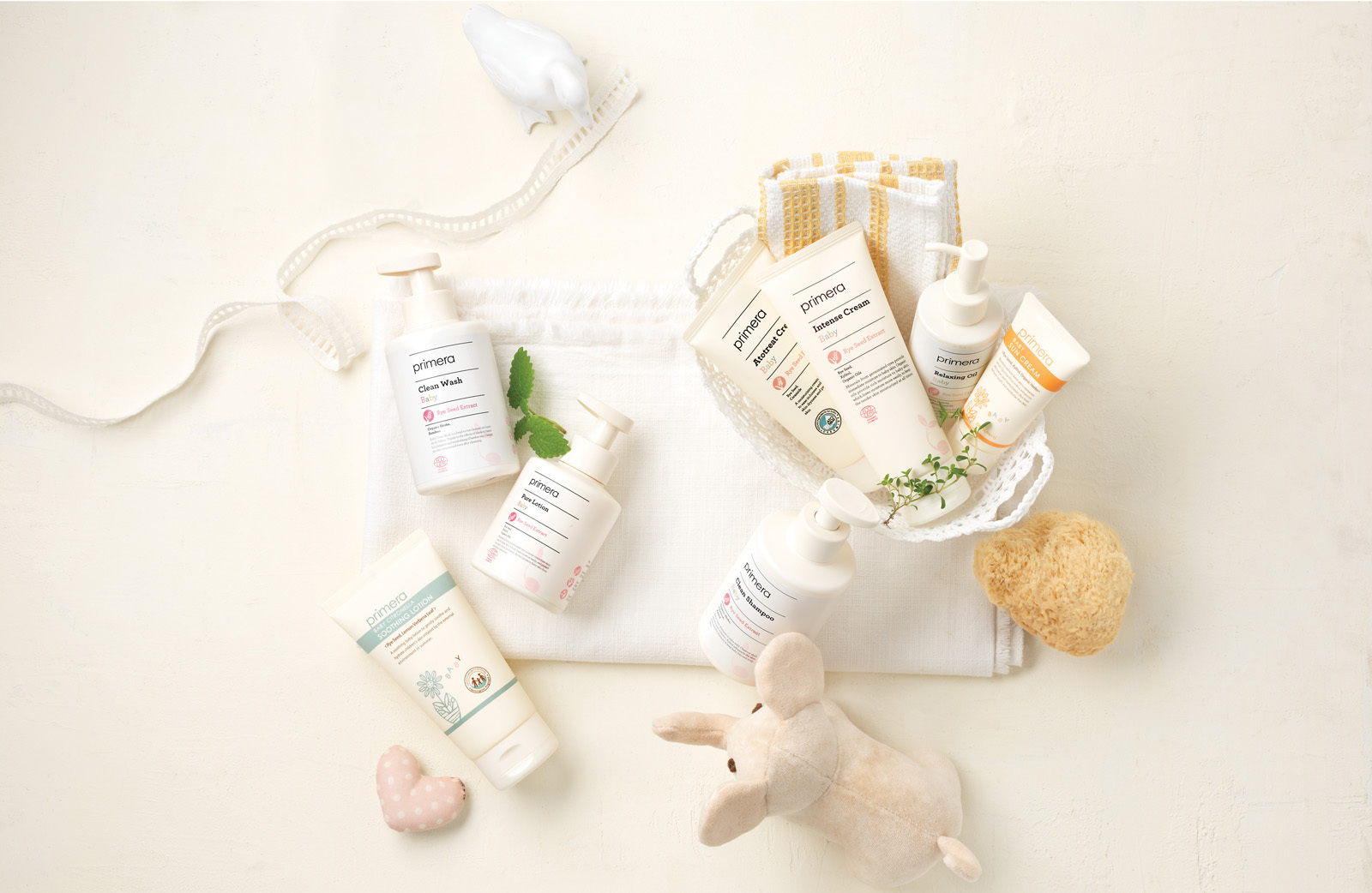
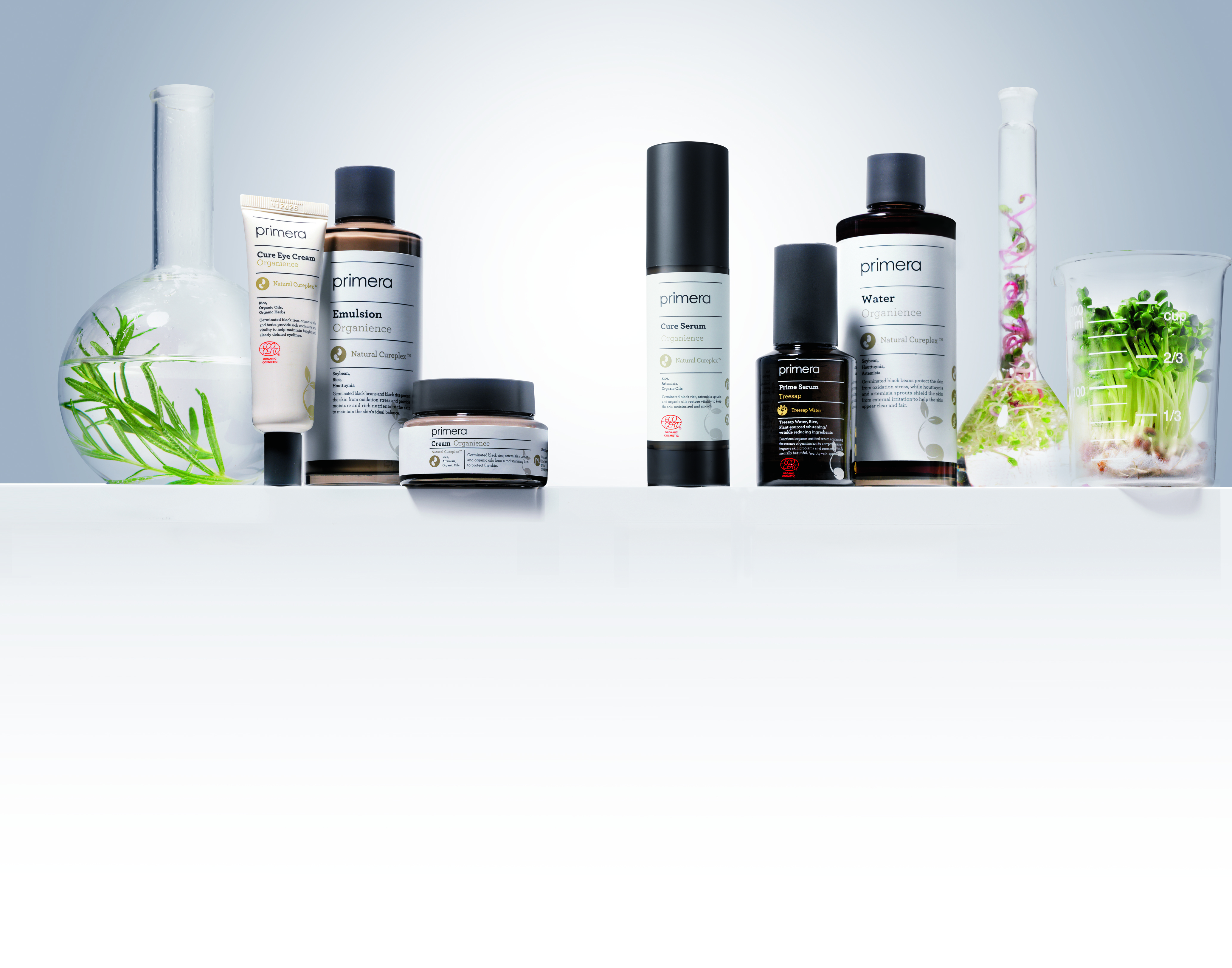
As the sales channel expanded through 2012, at the Primera brand department launching, the design strategy was changed and a design renewal took place. To convey the concept of “sprout” to the consumers more easily, a sprout icon was developed and used on the lower side of the container as a design concept. Representative ingredient icons and their functions were highlighted in front of the product to directly deliver their effects and functions to the consumer. Baby line used a no-shine pastel color to portray a soft, low stimulation baby product, which differentiates from other lines.