

Schumann-Nägler
Wine label design
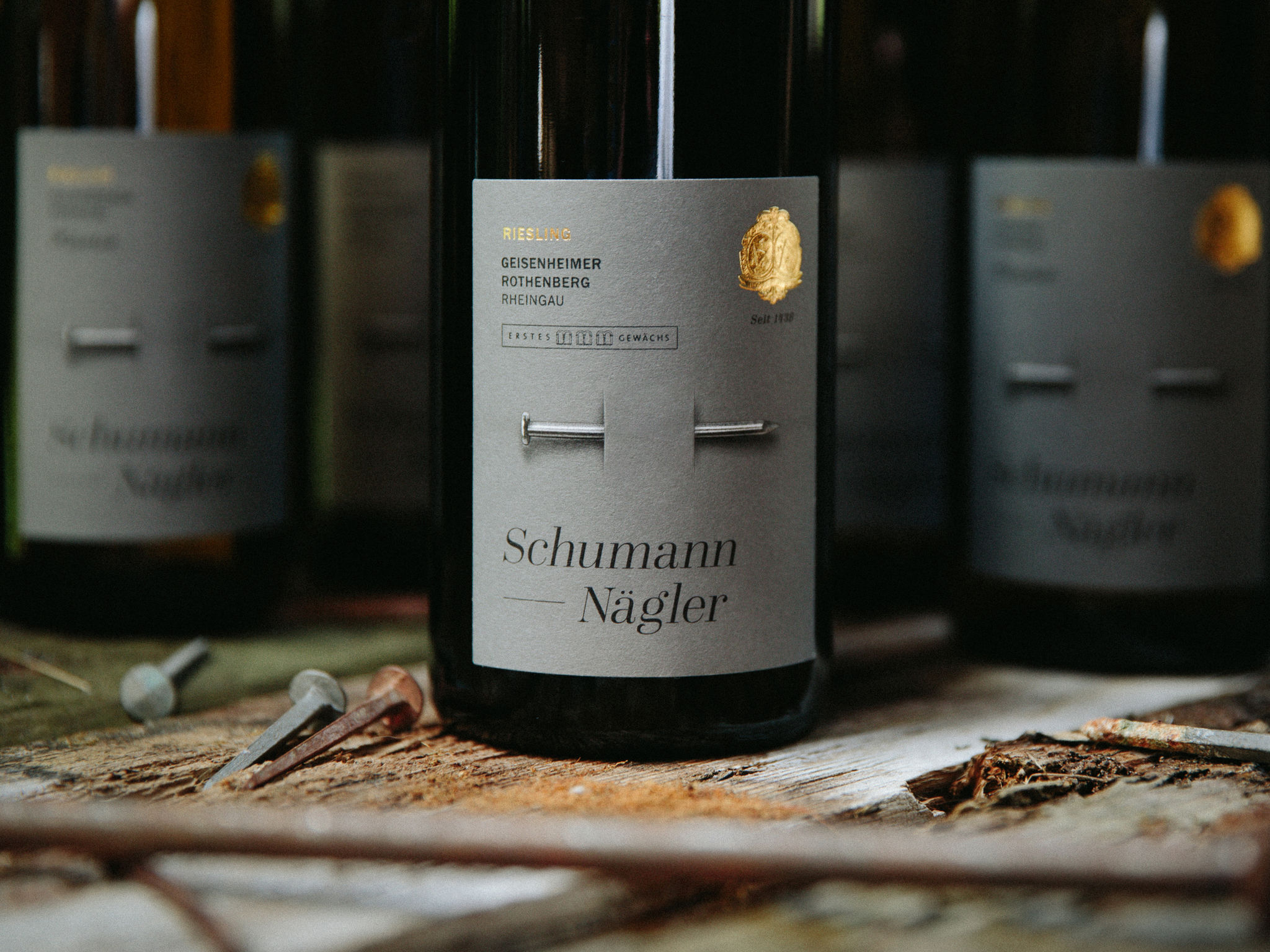
To expand the international business of Schumann-Nägler we needed more than their fantastic heritage that goes back to the year 1438. We needed something that would combine the modern with the traditional. Nägler? A nail. Unique in this form: driven through the bottle and label it stands for the absolute determination to create something special and the extreme quality the two brothers Philipp and David require of their wines. Because it needs to speak for itself, the entire series has been kept in a pure stone-gray and absolute minimalism – with one exception. The golden family coat of arms is applied with a specially 3D brass stamp.
Client / ManufacturerDesign
Weingut Schumann-Nägler
Geisenheim, DERuska, Martín, Associates GmbH
Berlin, DEDate of Launch
2016
Development Time
up to 12 months
Target Regions
Asia, Europe, North America
Target Groups
Consumer / User